

When it comes to wedding color palettes, some shades immediately evoke tradition — soft blush, creamy ivory, dusty blue. And then there’s chartreuse green: vibrant, unexpected, and utterly transformative. This bold hue adds energy, freshness, and a hint of whimsy to any celebration.
At Grace and Thorn, we love colors that tell a story, that spark emotion, and that feel alive. Chartreuse is all of that — and when used thoughtfully, it becomes a color that’s both modern and timeless.
Why Chartreuse Green Works in Weddings
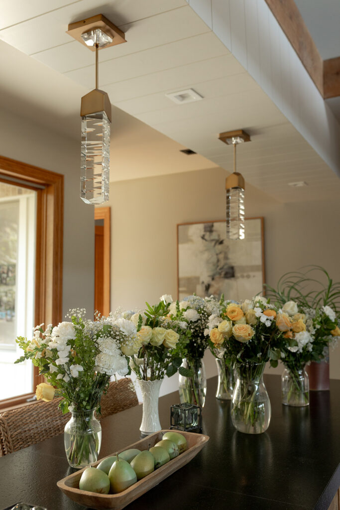
Chartreuse is bold, but it’s also versatile. It brings life to floral arrangements, liveliness to table decor, and a sense of surprise to stationery and linens. Pair it with neutral tones like cream, soft gray, or taupe to keep it sophisticated. Or combine it with deep jewel tones — think emerald, amethyst, or ruby — for a dramatic, high-impact palette.
This color works beautifully for:
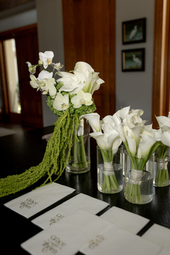
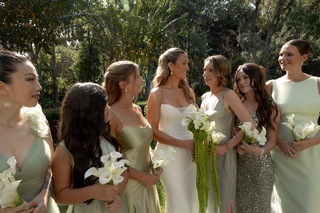
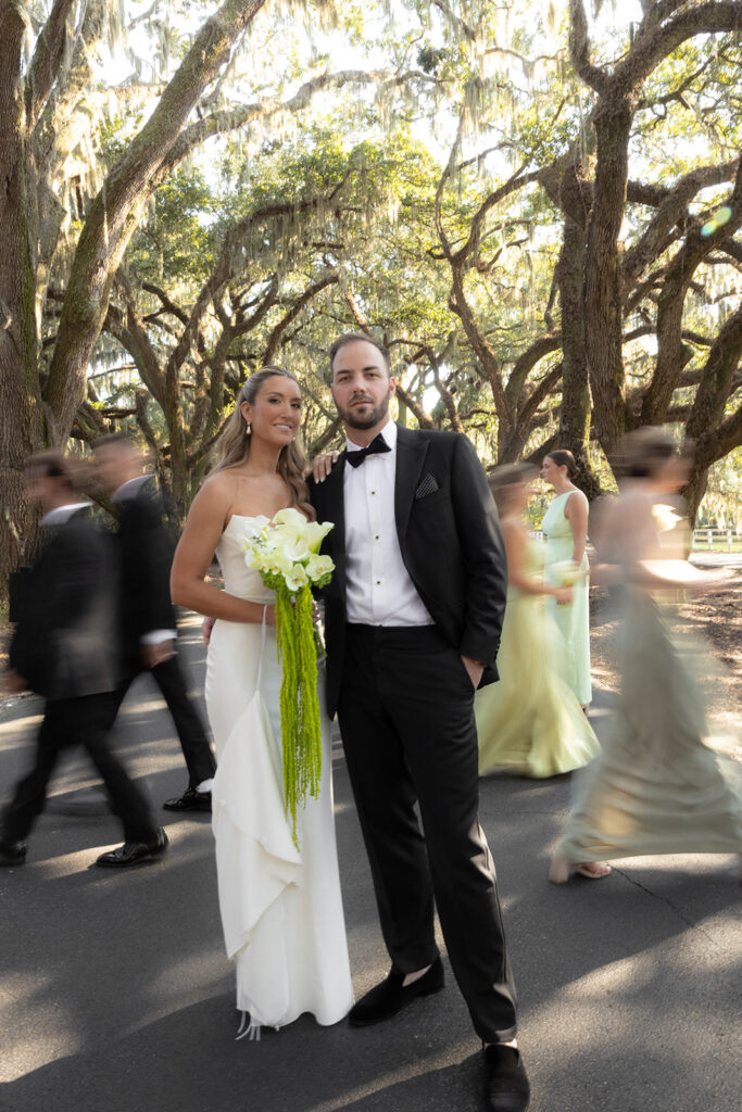
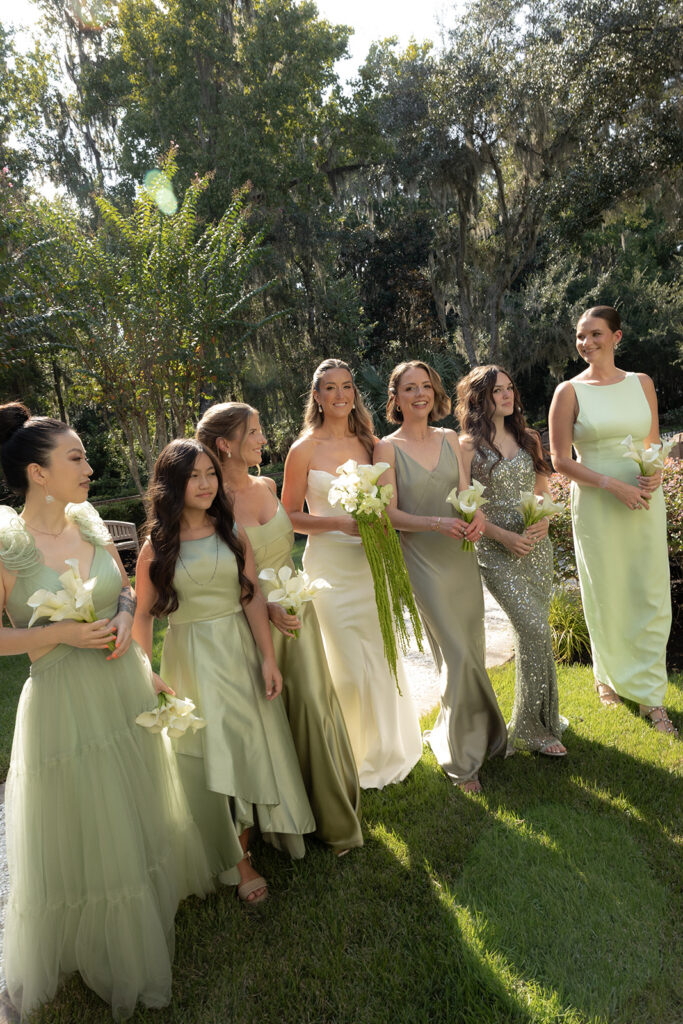
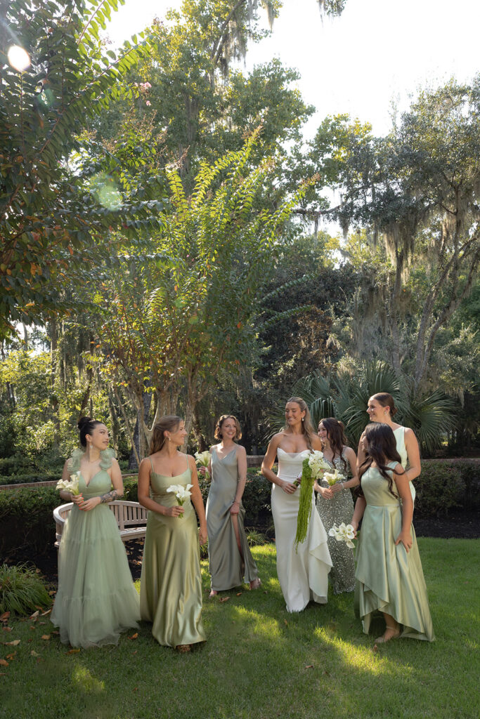
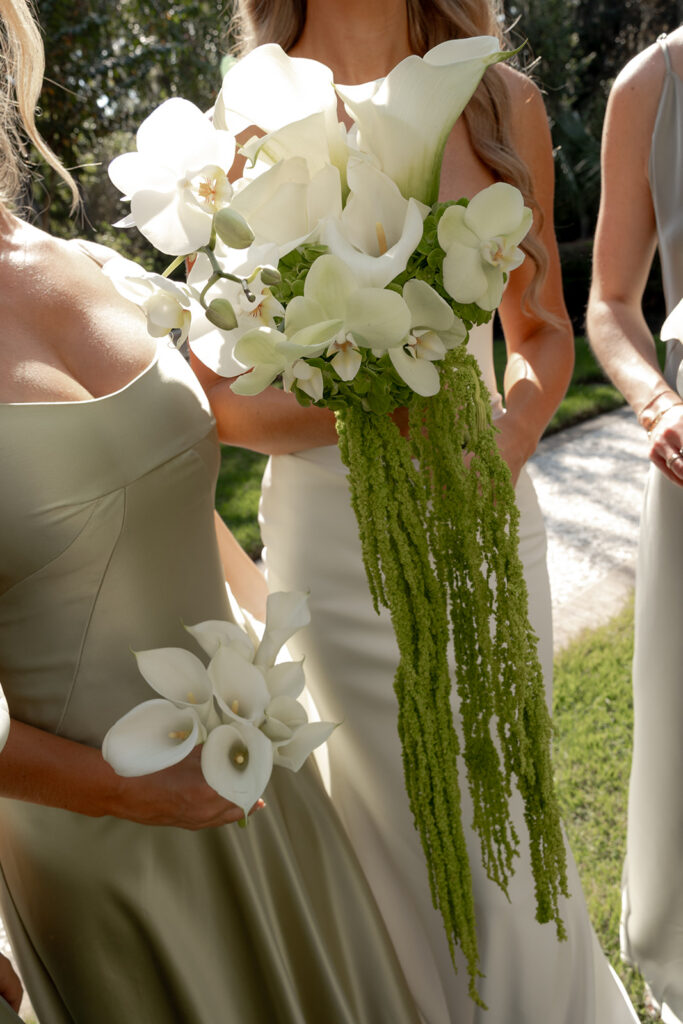
- Bridal bouquets: Chartreuse greenery and blooms feel fresh, organic, and playful.
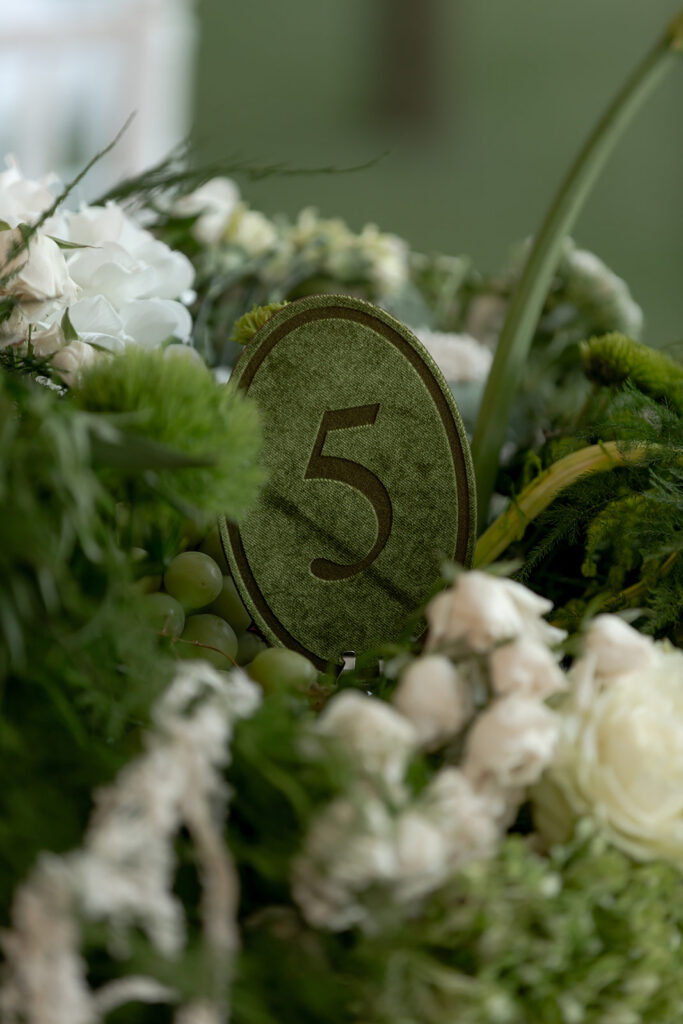
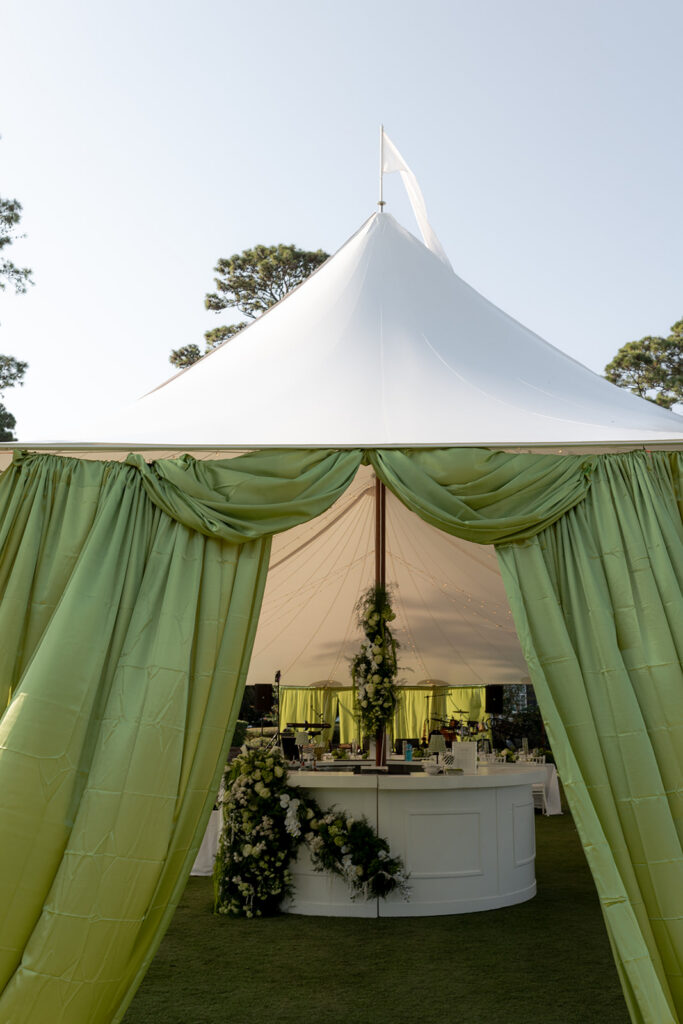
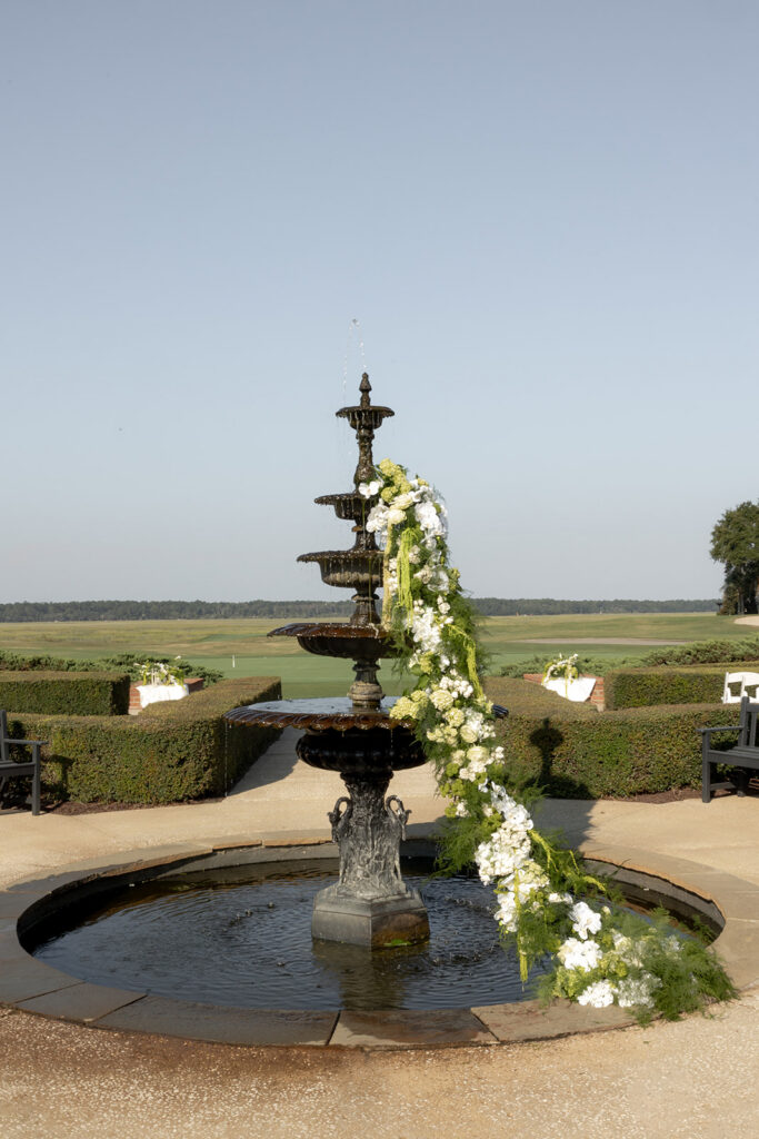
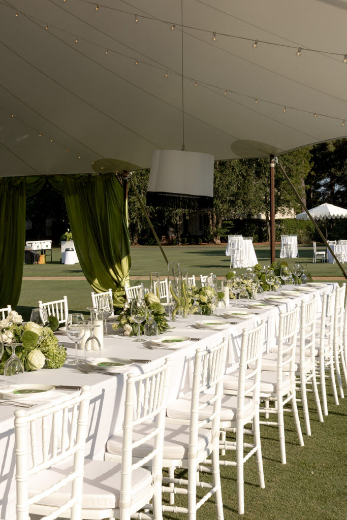
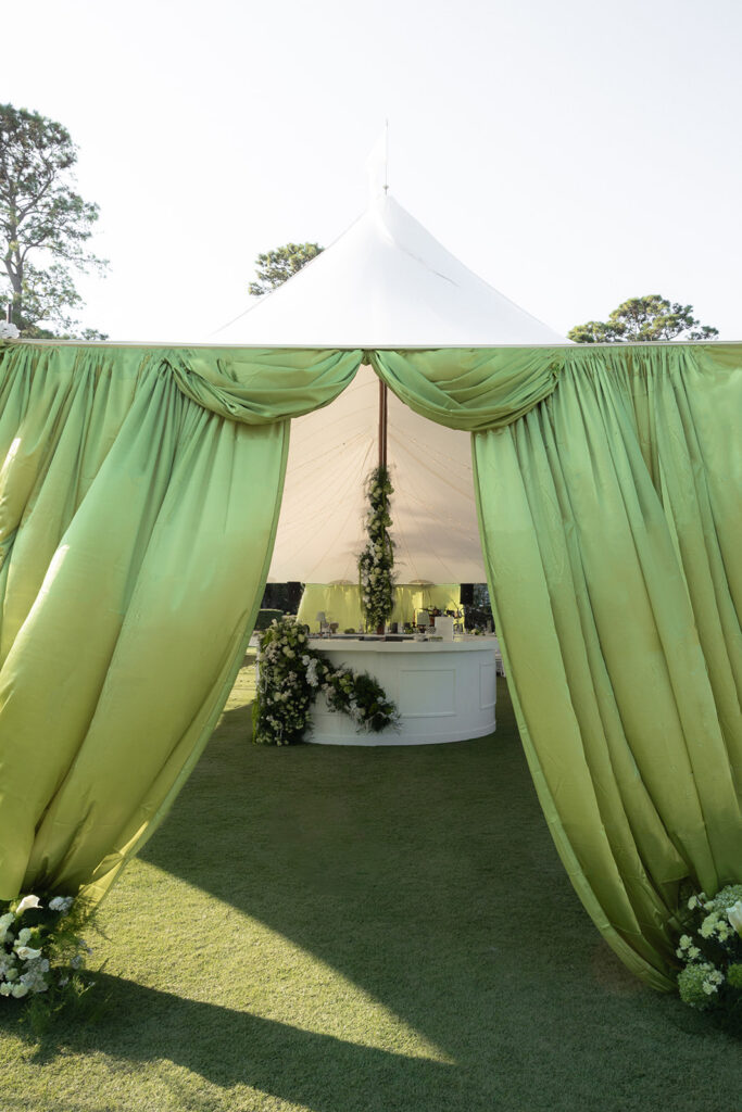
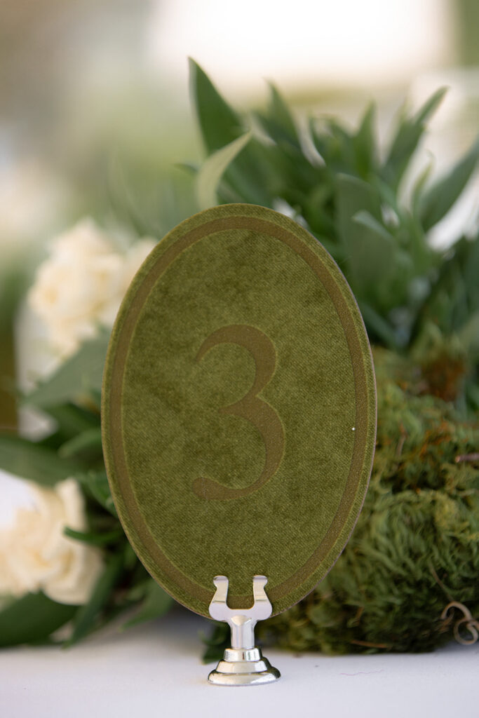
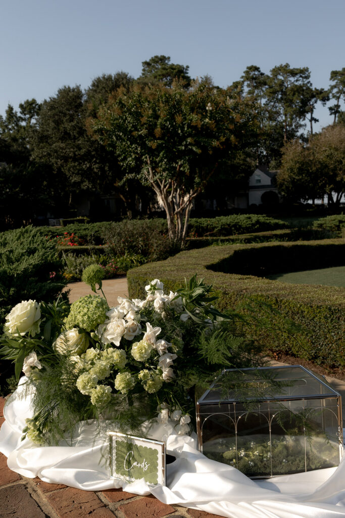
- Reception decor: From velvet table runners to whimsical centerpieces, the hue brings unexpected energy.
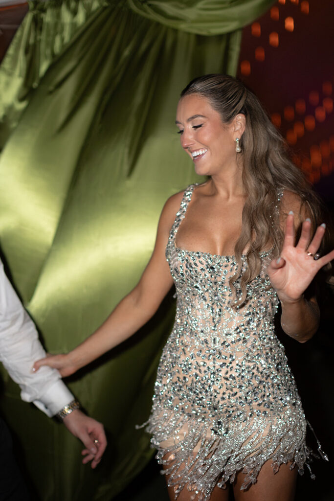
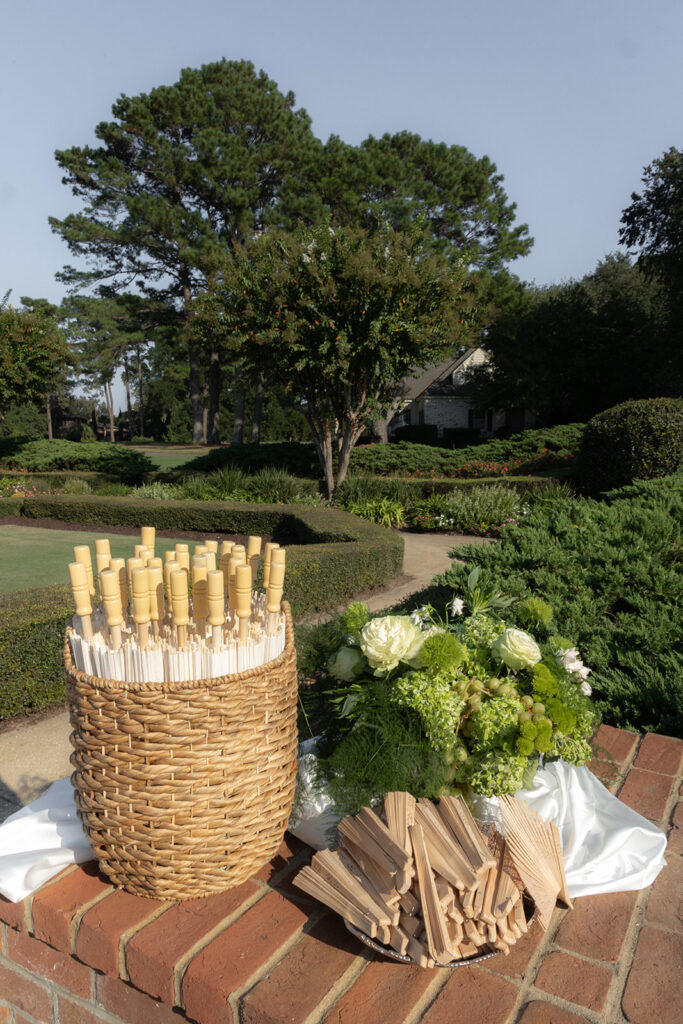
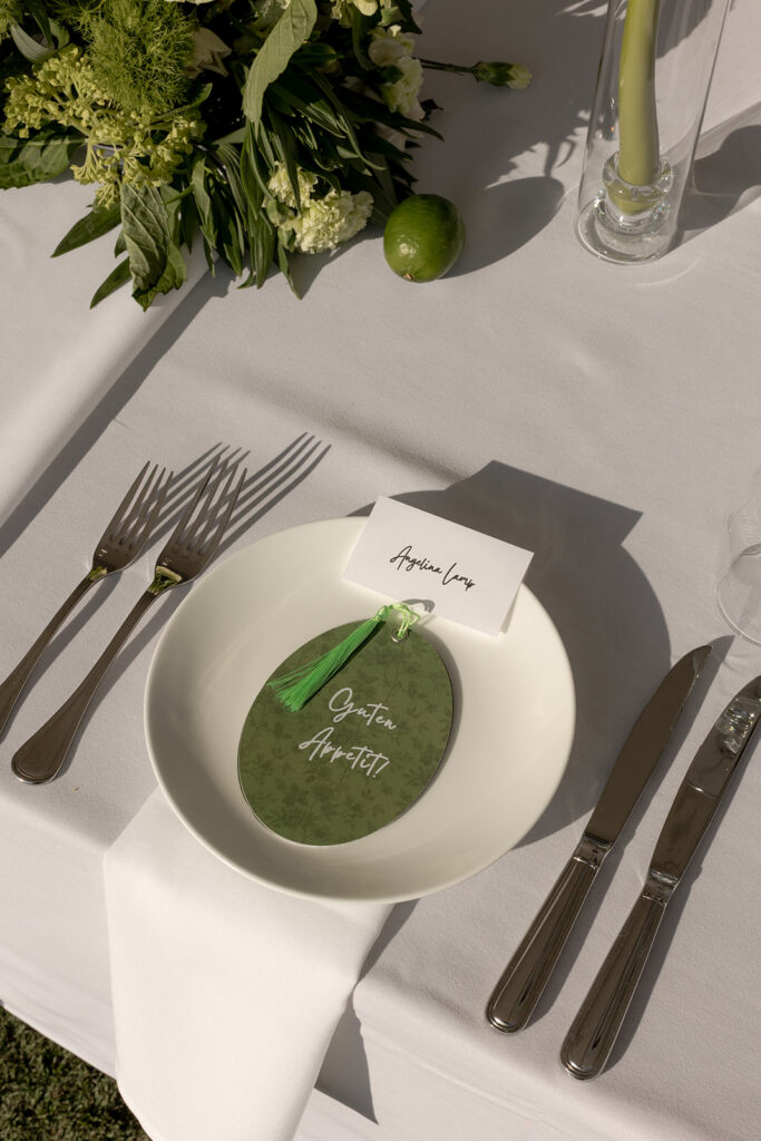
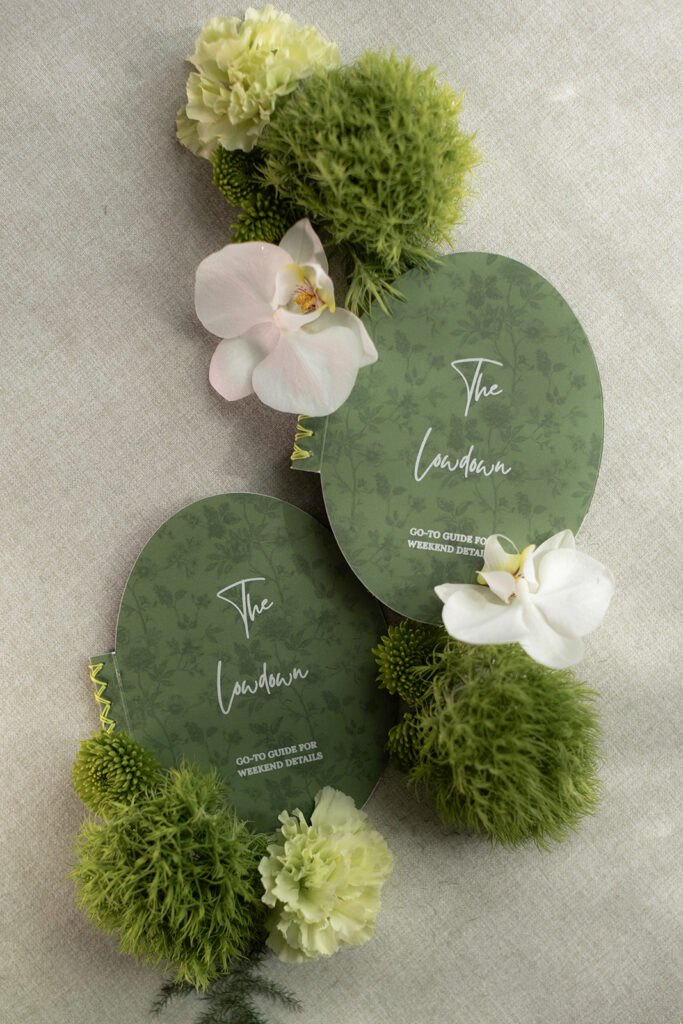
- Accents and details: Think chartreuse ribbon, bridesmaids’ shoes, or cocktail napkins for a subtle yet striking pop.
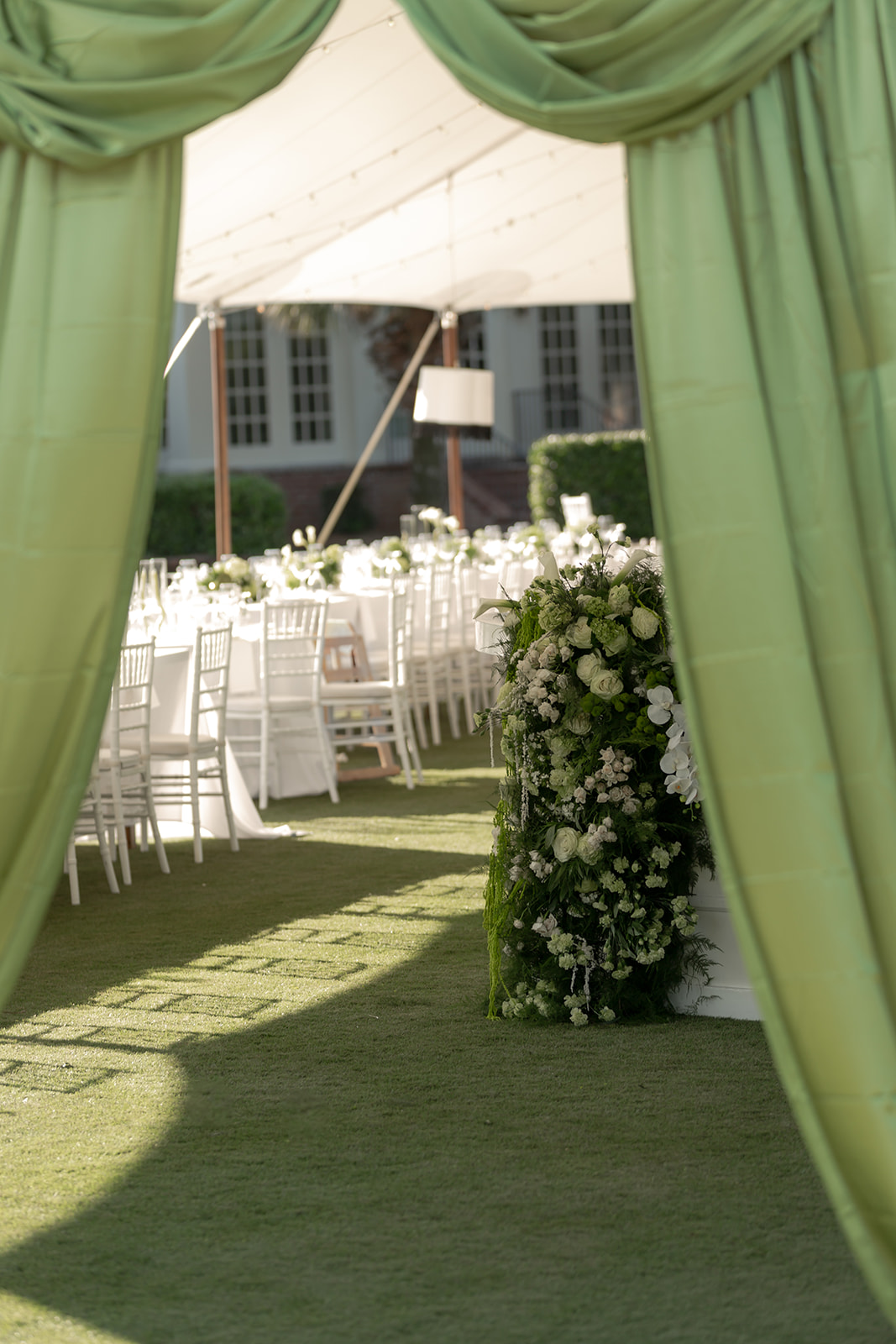
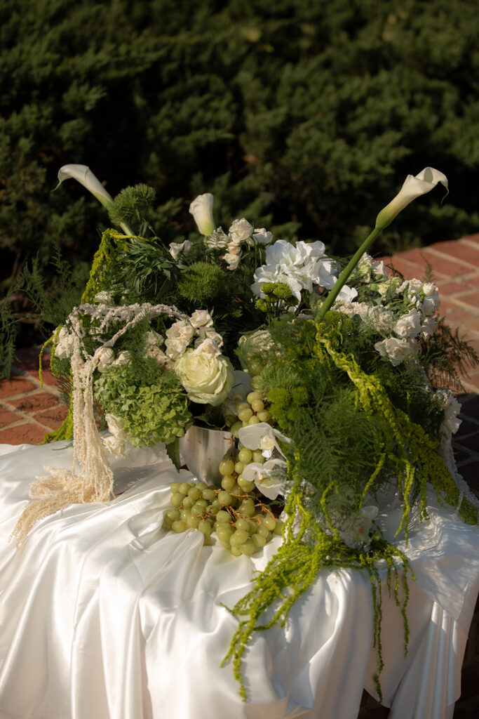
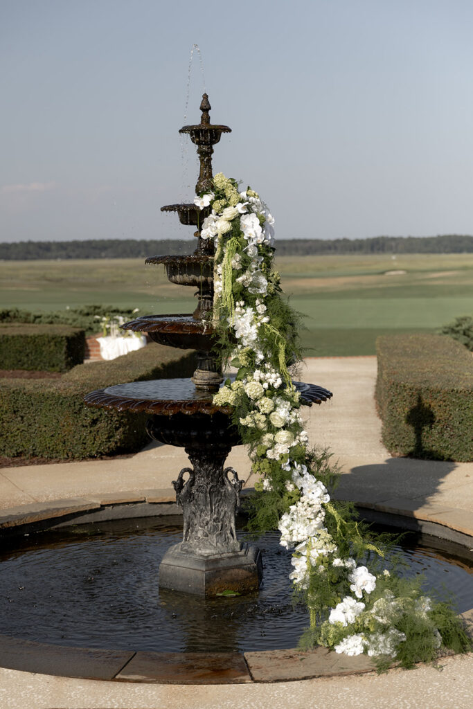
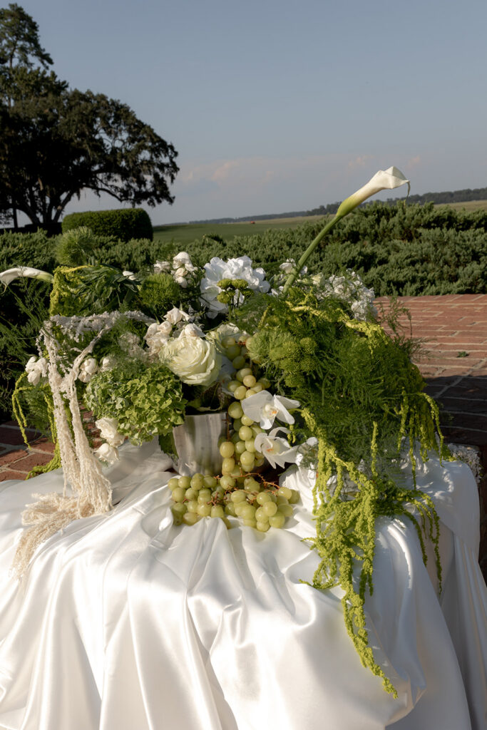
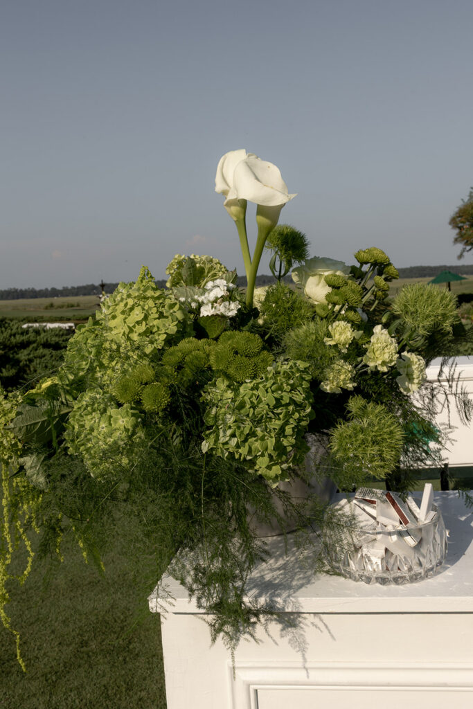
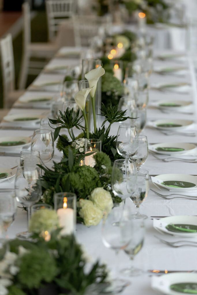
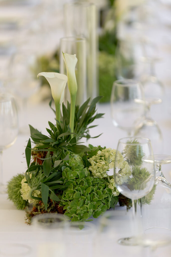
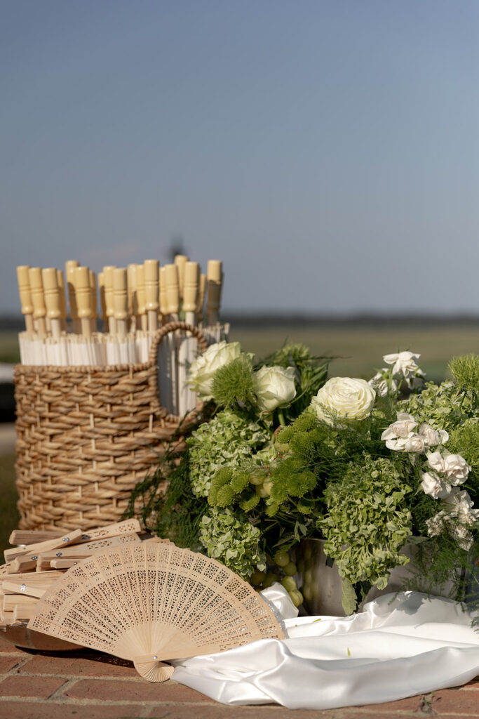
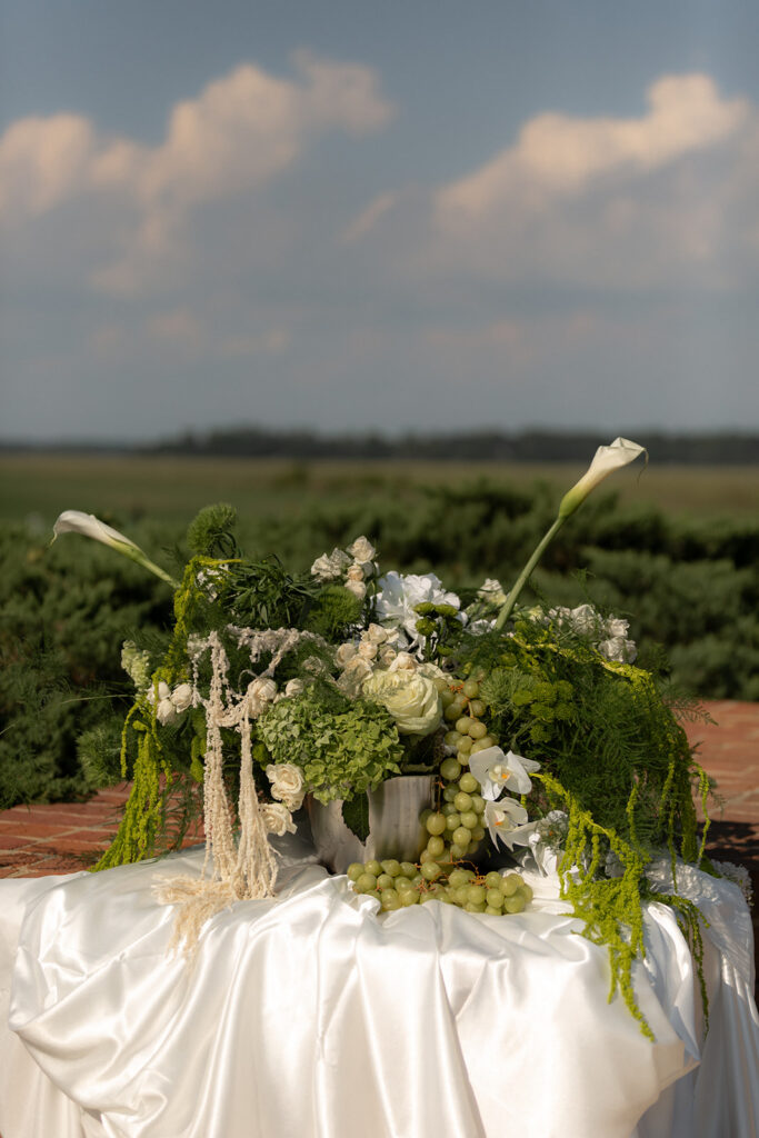
Chartreuse Green in Florals
One of our favorite ways to use chartreuse is through florals. Think textured greenery, delicate billy balls, green hydrangeas, or lime-hued roses. Its brightness adds dimension and contrast to both muted and jewel-toned palettes.
Floral designers often pair chartreuse with soft whites and blush for a romantic garden feel, or with deep purples and navy for a moody, dramatic effect. The result is always vibrant, unexpected, and beautifully dynamic.
Styling Tips for a Chartreuse-Inspired Wedding
- Balance is key: Chartreuse is a statement color, so balance it with neutrals or soft pastels.
- Mix textures: Combine chartreuse with velvet, silk, or metallics to elevate its sophistication.
- Layer thoughtfully: Use the color in flowers, linens, and stationery to create a cohesive yet playful look.
- Let it shine in small doses: If full chartreuse feels bold, integrate it through small accents like ribbon, cocktail signage, or cake details.
Inspiration for Using Chartreuse in Your Celebration
Whether you’re planning a spring garden wedding, a moody fall celebration, or a bright coastal fete, chartreuse green adds energy, freshness, and a touch of whimsy. At Grace and Thorn, we love seeing brides and grooms embrace bold color choices that reflect their personality — and chartreuse is a color that never goes unnoticed.
Gallery


Leave a Reply
BEGIN YOUR EXPERIENCE
Picture polished petals with a side of playful chaos — that’s us. If it grows, climbs, blooms, or trails, we’ll turn it into something joyfully over-the-top. Perfectly styled, slightly untamed, always unforgettable.
Full-service floral design serving Savannah and the Lowcountry

_websize")


Leave a Comment